Review: Alienated #2

Alienated #2

Publisher: Boom! Studios
Writer: Simon Spurrier
Artist: Chris Wildgoose
Colorist: Andre May
Letterer: Jim Campbell
Released: March 18th, 2020
Rating: 4 Star

Alienated #2 continues the quirky and somewhat odd adventure of three teenagers and the alien they accidentally came across in the wild. Yes, that really happened. And yes, it is exactly as entertaining as it sounds.

Now, Samir, Samantha, and Samuel are linked, both through strange mental abilities and through their discovery of Chip, the surprisingly adorable alien they’ve found. That means they have to somehow navigate high school, all while carrying more baggage than ever before.

Alienated #2 alt

The Plot

Simon Spurrier has really created such a unique reading experience in Alienated #2. This issue focuses mainly on Samuel’s internal monologue, but that sets the scene. It also implies what sort of format we can expect from the next issues, but that’s neither here nor there.

At the root of it, this is a high school drama infused with heavy science fiction elements. There are many classic subplots to expect from that, such as the snobby girl who thinks she’s better than everyone else, and the high school bully (and we all know how well that went for him!).

It’s a fun twist on the matter when you throw into that stereotypical mix three teenagers with access to human thought. Though really, that’s proving to only be the start of the access they actually have. It’s a bit concerning admittedly, but also really fascinating. In addition, I honestly can’t wait to see what happens next.

Alienated #2 pg1

The Art

The artwork inside Alienated #2 is sublime. We’re talking vibrant colors, dynamic scenes full of unexpected moments, and other fun twists like that. It makes for a truly memorable series and one that stands out among the rest.

Chris Wildgoose is the lead artist, and they’re the ones responsible for how our characters look. They’re also the ones drawing Chip, a character that I find to be unbearably adorable. I personally love the design, it’s clearly alien, while not falling under any stereotypes. It, like the rest of the series, is unique.

Andre May is the colorist, and honestly, the colors are what really make this series feel so vibrant and alive. The colors veer towards the overly bright, but it works so well, especially alongside the more alien themes.

Finally, Jim Campbell is the letterer, and you won’t be surprised to hear that he did a great job. At least, I wasn’t surprised. His grasp of subtle details allowed for an unobtrusive delivery of vital information.

Alienated #2 pg2

In Conclusion

Alienated #2 brought with it several more surprises, all while being highly entertaining. I think what I love most about this series is the fact that I honestly can’t predict what will happen next.

The series has already gone so much darker than I expected, yet it still feels so light and bubbly at the same time. It’s a fantastic mixture of elements, and I know I’ll keep coming back for more.

Review: Red Mother #4

Red Mother #4

Publisher: Boom! Studios
Writer: Jeremy Haun
Artist: Danny Luckert
Letterer: Ed Dukeshire
Released: March 18th, 2020
Rating: 4 Star

Red Mother is arguably one of the more disturbing and chilling series I’ve been reading of late. And that’s saying something. Daisy’s tale is both alarming and intriguing, in just the right proportions. It’s also difficult to predict what will happen next, a fact that has surely increase the tension.

As if the events of her recent past weren’t enough, it seems like there’s a new mystery on the horizon. One that comes in the form of a charming executive that wants to employ her. Perhaps, if that was the end of the surprises, Daisy could handle it all. But it isn’t.

Red Mother #4 is one of the more alarming issues of the series, a fact that surprised me. The plot is starting to move forward in leaps and bounds. Yet there are so many questions left to be answered.

Red Mother #4 alt

The Plot

Red Mother #4 started out in a way that I didn’t expect. By that, I mean that it was almost a casual and normal day, for Daisy. You know, if you discount that first scene painted in red. Yet there’s something almost foreshadowing in the normalness of it all.

That is where Jeremy Haun’s writing shines. He’s managed to make the normal feel terrifying, and it’s all because you don’t know what’s going to happen next. A feeling that is rapidly rewarded, thanks to the events that unfold in this issue.

I can tell you with complete honestly that I do not know what’s going to happen next. Nor do I (yet) see the connection between this new executive and the mystery of what happened to Daisy. I actually kind of love that about this series. It’s refreshing to give up the reigns and just follow along and be surprised (or terrified).

Speaking of, I feel like the horror elements went up a few notches in this issue. Perhaps that’s just me though. I don’t exactly watch horror movies (weird, I know). That being said, the progression, while sudden, also feels natural. Perhaps because it has also felt so inevitable.

Red Mother #4 pg1

The Art

Red Mother #4 features a variety of scenes, expressions, and settings. It makes for a visually stunning piece, though some scenes are surely going to be more memorable than others. Even in the calmer scenes, Daisy’s character design seems to stand out. A constant reminder of her past and the future we presume is lurking ever closer.

Danny Luckert is the lead artist for this project, providing everything minus the lettering, which was done by Ed Dukeshire. Together they’ve created a horror story worth following, full of the iconic elements that have made it so memorable.

Naturally, that means the more alarming scenes will be more memorable. Nevertheless, it’s all simply setting the scene for something so much bigger. And the artwork perfectly supports the story being told.

Red Mother #4 pg2

In Conclusion

Red Mother #4 is one of those issues that really threw me. It wasn’t at all what I expected, and yet it was still brilliant. I find myself coming up with more questions with each issue, all of which I’m eagerly looking forward to finding the answers for.

Review: Wicked Things #1

Wicked Things #1

Publisher: Boom! Box
Writer: John Allison
Artist: Max Sarin
Colorist: Whitney Cogar
Letterer: Jim Campbell
Released: March 18th, 2020
Rating: 5 Star

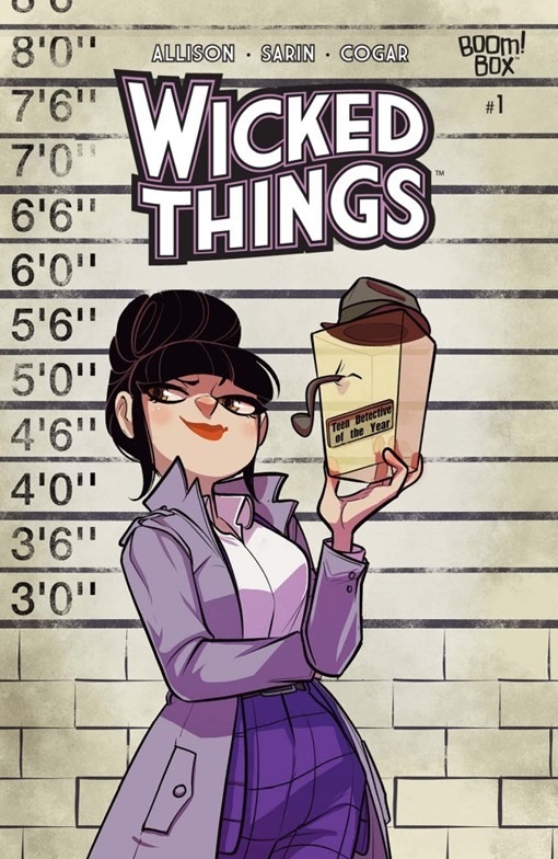
Wicked Things is the latest new series from a creative team many of you will recognize! John Allison and Max Sarin, the creators behind Giant Days, are once again working together to bring us a charming and fascinating new series. They’ll be working alongside artists such as Whitney Cogar and Jim Campbell too, so that is even more exciting.

Charlotte Grote is nineteen years old, and she’s running out of time to get attention for being a teenage sleuth. After all, only one more year and she will officially no longer be a teen. Unfortunately, that quickly becomes the least of her problems.

You see, Charlotte Grote is about to be framed for a murder. Yes, the irony is strong in that situation. But it does force her hand nonetheless. And that is where our series begins.

Wicked Things #1 alt

The Plot

Being a huge fan Giant Days it’s safe to say that I had extremely high hopes for this series. Thus far, my hopes have not been let down. I absolutely adore the introduction to this latest series. John Allison, alongside the rest of the creative team (see below), has created a charming and enchanting tale once again.

Wicked Things #1 is highly charming, full of quirks and drama. Everything from the way Charlotte is presented to the intrigue and tension that follows is perfection. And yes, that does include the dramatic twist at the end of this issue.

There is something so endearing about Charlotte, especially the casual version of her presented early on in the issue. Where she’s relaxing around her house and arguing about what can and cannot be thrown out. You’ve got to admit, that is a scene most of us can identify with.

Even if we’re not master sleuths in training, that is. From there, Charlotte’s adventure quickly grows in scale, culminating in the events that have been advertised early on (hint: her being framed). I’m extremely curious to see the follow-up, even though I have a general idea of what sort of circumstances she’s going to end up in. But that just proves my emotional investment, right? Either way, I can’t wait for next month!

Wicked Things #1 alt2

The Art

If you’re a fan of the artwork provided in Giant Days, then you’re going to love Wicked Things #1. The characters are adorable and charismatic in their designs, while still reading as unrelentingly human in their expression and emotion.

Max Sarin was the lead artist for this issue, obviously. That’s where most of the style and charm is coming from (and I love it). In particular, I’m finding myself loving the aesthetic of the series. Think of a classic detective series, and then throw a comic spin on it. That’s what you’re getting here, and it’s amazing.

Whitney Cogar was in charge of coloring, and they did an excellent job. Most of the colors are bold and dominant, but honestly, it works really well in this series. Charlotte’s personality would demand nothing less, after all.

Jim Campbell provided the lettering, and unsurprisingly he did an amazing job here. His attention to detail allowed for many subtle moments. Not to mention the avoidance of clutter, even on the pages that required a lot of detail to be provided.

Wicked Things #1 pg1

In Conclusion

Wicked Things #1 was exactly what I hoped it would be. It’s a highly entertaining diversion, providing a blend of out of this world plot with down to earth characters and elements. This series is going to be perfect for Giant Days fans, especially those still mourning the loss of the series (myself included).

Review: Outlawed #1

Outlawed #1

Publisher: Marvel Comics
Writer: Eve L. Ewing
Artist: Kim Jacinto
Colorist: Espen Grundetjern
Letterer: VC’s Clayton Cowles
Released: March 18th, 2020
Rating: 4 Star

Outlawed #1 is the start of a new event about to rock the Marvel Universe. It is technically a standalone issue, but the events that occur within it are going to affect many series. Especially the series focused on our youngest heroes.

The events of Outlawed #1 follow everything that happened in Incoming, which can make following the thread a bit more difficult. From here, if you want to keep up with events, you’ll want to check out Champions: Outlawed (April), as well as New Warriors, Power Pack, Ms. Marvel, and Miles Morales: Spider-Man.

Now that we’ve gotten that out of the way, let’s talk about the actual issue at hand, shall we? Outlawed #1 focuses on many of the teen heroes we’ve come to love from Marvel. But it also takes into account the one thing they all have in common: they’re underage. And they’re vigilantes. Until the events in these pages, most (but not all) people had been willing to look the other way. But that is no longer the case.

Outlawed #1 pg1

The Plot

Holy cow. Eve L. Ewing sure knows how to set up an event, huh? Outlawed #1 starts out on one note, and ends on a completely different one. Even having a strong idea of what was going to happen (I made the mistake of reading another issue first, one that gave away everything that happened here), I was still blown away by what happened.

The introduction was something else though, seriously. I love the idea of everyone being interviewed. It was dramatic, but it also provided insight into how many of the characters were reacting to what happened (or will happen, I suppose).

As for the core plot, which resulted in such drama? It was fairly interesting. I love all of the hat tips and references that are strewn about. It made the whole setup feel more plausible, and certainly less forced. It also (obviously) went a long way in explaining how on earth we ended up in this situation, to begin with.

Did the reaction feel slightly out of proportion? Maybe. Probably. But then again, most political reactions in comics feel that way – with intention. Think about the arguments that happened during both Civil Wars. So I’m not surprised at all about what is happening here.

Side note: It’s so cool to see Speedball referenced again. Though seriously, how does he keep ending up on these task forces? Does somebody have something on him, or does he just like feeling included?

All that aside, I really am looking forward to seeing how this is going to affect all of the series. I’ve already seen the impact in another series I adore (Ghost-Spider), and will be curious to see how it impacts the heroes that actually reside in Earth 616.

Outlawed #1 pg2

The Art

The art behind Outlawed #1 is every bit as dramatic as you might expect – and hope. We’re talking about a dozen different characters (heroes) working together, as well as the trouble that would actually put them at significant risk.

Leading the project was Kim Jacinto, who provided the foundation of everything to follow. Their lines allowed for dramatic scenes, including several fights, a dragon, and many emotional reactions for what actually occurred. It’s a lot to take in, and all the more impressive for it.

Meanwhile, Espen Grundetjern provided the colors, and I honestly love what they did here. The colors are bold and bright, especially in times of stress or drama. The colors portraying powers (be it tech-based or organic) were fantastic and really added a whole new visual element.

Finally, VC’s Clayton Cowles was the letterer, and they did a brilliant job here. I’m honestly not sure that the words would have had the same impact if they had not been so meticulously placed.

Outlawed #1 pg3

In Conclusion

Outlawed #1 is one of those events that fans should check out, especially if they’re reading a series that’s going to be impacted by it. There are some obvious series (Miles Morales, Ms. Marvel, etc), but there are also some series that you might not have expected on that list (Ghost-Spider), so be sure to read it soon. That is, if you don’t want it to be spoiled for you.

Review: Hawkeye: Freefall #4

Hawkeye Freefall #4

Publisher: Marvel Comics
Writer: Matthew Rosenberg
Artist: Otto Schmidt
Letterer: VC’s Joe Sabino
Released: March 11th, 2020
Rating: 4 Star

Hawkeye: Freefall has been a highly entertaining yet slightly chaotic series. Given that this is a series focused on Clint Barton, that probably shouldn’t come as too much of a surprise. In true Barton fashion, his latest scheme has become increasingly complex, pitting him against the friends and allies he holds so dear.

You see, Hawkeye: Freefall #4 brings us a version of Barton trying to balance so much, all while keeping his secret safe. And it is one heck of a secret. The real question is, how long can he keep it under wraps? And what sort of chaos will arise in the meantime?

Hawkeye Freefall #4 pg2

The Plot

Once again, Matthew Rosenberg has written us a chaotic yet surprisingly intense issue. Hawkeye: Freefall #4 has a little bit for everyone. It’s full of action, drama, humor, and some seriously spectacular moments. In short: it was everything I had been hoping for.

The last issue ended off on a bit of a cliffhanger, a fact that this cover strongly alludes to. Keeping a secret is pretty difficult when around people like Daredevil, as Barton is about to learn. This moment could have gone many ways. But the strange balance of humor and intensity was surprising…yet oddly perfect. I wouldn’t have had it any other way.

The same applies to the rest of this issue, actually. It’s all that strange balance. There’s a lot going on, and some of it fairly heavy. Yet it’s all tinged with that humor that we know and love from Hawkeye. Perhaps that is why it is such an enjoyable read, even when it looks like this might go south (I mean, it’s kind of expected at this point, right?).

Once again this issue concludes with a scene that makes me desperate for more. I’m not sure if that’s brilliant or pure evil. But I do know that I can’t wait until next month, because I’ve got to see how that whole mess plays out!

Hawkeye Freefall #4 pg2.

The Art

Hawkeye: Freefall #4 had so many brilliant moments inside it. Personally, I love how the artistic team really managed to showcase just how much damage Barton can take. Okay, I also adored the way they portrayed the more humorous moments as well. But can you blame me?

Otto Schmidt was the lead artist for this issue, and as such, you can thank them for all of those action scenes. I also love the way all of the cameos were drawn, they were iconic and yet stylized at the same time.

Another thing I like about this series? It doesn’t shy away from the blood. Hawkeye is a character that gets hurt. It happens. Sometimes a lot, especially when in a solo series. That means there’s going to be blood. It isn’t an extreme amount by any means, but it does bring all of the damage to light, and I appreciate and respect that.

VC’s Joe Sabino was the letterer for this issue, and unsurprisingly they did a fantastic job. I’ve always loved their work, and it really seemed to shine here. Or rather, it was so subtle in what it did that it was perfect.

Hawkeye Freefall #4 pg3

In Conclusion

Hawkeye: Freefall #4 was everything that I had hoped it would be, and then some. It was chaotic and intense, funny and terrifying, all bundled into one. I honestly can’t wait for the next issue to drop, because I’ve got to find out what happens next. I have a feeling I won’t be the only one feeling that way, either.

Review: Dryad #1

Dryad #1

Publisher: Oni Press
Writer: Kurtis J. Wiebe
Artist: Justin Osterling
Released: March 4th, 2020
Warnings: Animal death
Rating: 4 Star

Yes! It’s time! Dryad #1 has finally dropped, and I personally couldn’t be more excited about that fact! If you’re a fan of Rat Queens, then this is absolutely a series you’re going to want to check out.

Why do I say that? Because Kurtis J. Wiebe is the author for both series, and there are so many tones and themes in common. So the odds are very good that if you like one, you’ll enjoy the other. I know I did. Working alongside Wiebe is a new artist, Justin Osterling, but his style is already proving to be one worth keeping an eye on.

It’s a tale of love, lore, monster hunting, and so much more. And that’s only the beginning. An elf and a human fall in love – that’s a tale we’ve all heard before. Together they’ve found a safe haven for which to raise their family in. But how long can one family be content to be merely ‘safe’?

Between the creative team and the description for this series, I was understandably quite excited about this release date. Now the real question is; was it worth the wait?

Dryad #1

The Plot

It is officially safe to say that Kuris J. Wiebe has done it again. Once again, he has introduced a compelling plot. His characters here are intriguing and complex. While not all of them may be human, they infuse the story with their relatability.

Dryad #1 starts on an interesting note, immediately pulling readers (myself included) into the story. It is a great start, as is the rest of this issue. It is a fascinating world with complicated characters, all of whom seem to have their own backstory and baggage.

Speaking of baggage, I feel like there is actually quite a bit more to the history of these two lovers. I have a feeling that their children are going to end up uncovering that mystery for us, and I honestly cannot wait.

Dryad #1 is split into two distinct time periods. Because believe it or not, there’s a significant time jump after the introductory scene. It was a clever way of setting the stage. Our characters’ backstories have been revealed, all while leaving us curious as to see what happens next.

Honestly, I really enjoyed this first issue. I have so many questions and theories for what is going to happen next, all of which is proof of how engaging the story has already proven to be. I don’t actually have any idea what is going to happen next. And I love that.

Dryad #1 preview 1

The Art

I honestly loved the artwork behind Dryad #1. It is every bit as fantastical as the genre itself. The two go perfectly hand and hand, which honestly is not a given. So I’m going to appreciate that fact.

Justin Osterling really brought this fantasy world to life. The characters and monsters are all intriguing, with careful decision choices being clear throughout the entire issue. A highlight for me had to be the characters’ expressions, which ran the gambit (two parents, a teenage girl, and a teenage boy, need I say more about the emotional range being displayed?).

Actually, I’d like to add a second highlight to this review. The backgrounds. I’m absolutely in love with the backgrounds for this series. The forest scenery is both beautiful and the perfect setting for a fantasy series. But it’s really the colors that make it all come to life. They are vibrant and striking. And I would love a print of some of these scenes.

Dryad #1 preview 2

In Conclusion

Dryad #1 was everything that I had hoped it would be, and then some. I’m honestly incredibly curious to see where this story leads us. I’ll admit some extra curiosity to what the parents have done in their past…and what their teenage children will do next. But that’s all the more reason for me to count down the days until next month!


The Warnings

Sometimes a series will hit a moment that is upsetting to some readers. In this instance, there are a couple of animal deaths worth mentioning. Both of them have a slight warning (a panel or two to realize what you’re in for). But I’ll state them clearly here as well. Spoiler warning! A bloody dog corpse is displayed at one point, and a bird is killed later on.

Blog at WordPress.com.

Up ↑