Review: Hawkeye Freefall #2

Hawkeye Freefall #2Publisher: Marvel Comics
Author: Matthew Rosenberg
Artist: Otto Schmidt
Letterer: VC’s Joe Sabino
Released: January 29th, 2020
Rating: 4 1/2 Star

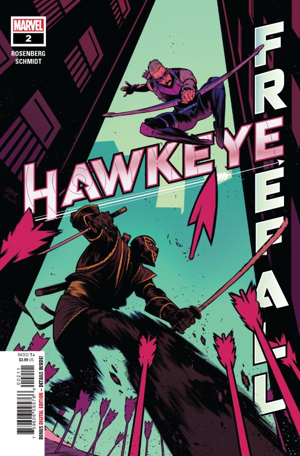
Hawkeye is back and more mischievous than ever in Hawkeye: Freefall #2. Clint Barton has been known by many names over the years. One of his most infamous would be that of Ronin. Being that he’s not the only person to have carried that particular mantle (or the mantle of Hawkeye, for that matter) things can get a bit complicated.

Say when somebody starts running around the city in the Ronin suit causing havoc and ticking off all of the heroes in town. That’s a good way to get a lot of eyes looking Clint’s way – and fast. And that is where our story begins.

Hawkeye Freefall #2

The Writing

Hawkeye: Freefall #2 was a whirlwind of an adventure. You know Barton – he’s the type of character who is all over the place. That remains true in this issue as well, as he bounces back and forth between his hero time and his time spent impressing his girlfriend (Night Doc – good for you, Clint). And a few other extracurricular activities to boot, because this is Barton we’re talking about.

Matthew Rosenberg has honestly nailed the whole Hawkeye vibe here. For starters, the guy almost always has a cut or bruise on his face, which is about par for the course. For another, he’s got readers constantly guessing about what is really going on here.

It makes for a chaotic and fun read, one that is unpredictable and entertaining. This is the Hawkeye I know and love, and I’m going to enjoy every minute of this story. Especially the moments that bring other Marvel characters onto the page – and that’s been happening a lot lately – much to my delight.

This issue left me with so many questions. Sitting here and thinking, I can sort of see how some of the puzzle pieces are going to slide into place. But I’m really looking forward to hearing the explanation from Barton himself, as that alone would be highly entertaining.

Hawkeye Freefall #2 pg2

The Art

The art behind Hawkeye: Freefall #2 is as entertaining as the character it’s portraying. Otto Schmidt was the lead artist for this issue, working alongside VC’s Joe Sabino for the lettering. And man, there are a lot of iconic (and crazy) moments to enjoy here.

One of my personal highlights would have to be Clint’s face. And by that I mean, how expressive he is. He’s one of those characters that doesn’t do a great job of schooling his expressions, and I love that this is portrayed so beautifully in the comics.

I’m also in love with the colors for this issue, but that’s probably no surprise. I love the lush and vibrant colors that Schmidt chose, especially as the backdrops. It makes everything feel so much more alive while making my eyes dance with happiness.

Hawkeye Freefall #2 pg4

In Conclusion

Hawkeye: Freefall #2 was a fun-filled and Barton-fueled barrel of chaos. And by that I mean, it was a blast to read. I’m very much looking forward to the next issue in this series, for I have a lot of questions that I’m hoping it will answer. Until then!

Review: Red Mother #2

Red Mother #2Publisher: Boom! Studios
Writer: Jeremy Haun
Artist: Danny Luckert
Letterer: Ed Dukeshire
Released: January 15th, 2020
Rating: 4 1/2 Star

Red Mother #2 was another dramatic addition to this series. It may only be two issues in, but I’ve already found myself eagerly awaiting the next installment of this series! There’s no doubt that this is one of the most stunning and stylistic series I’ve been reading as of late. Combine that with a chilling plot and consider me sold.

The first issue introduced us to Daisy and her boyfriend, Luke, who is now among the missing. Now we get to see how she’s been coping with everything…and hopefully learn a bit more about who or what this Red Mother is.

Red Mother #2 alt

The Plot

Red Mother #2 is every bit as chilling as the first issue in the series. Though perhaps with a slight alteration in tone. Daisy is still in a fair bit of danger – though that fact has become less clear, as time takes her away from the events that took her eye (and her boyfriend).

It felt like a lot of this issue was focused on Daisy trying to deal with her trauma…but at the same time there’s this highly disturbing undertone to the issue. Perhaps that’s because we know the story is far from over. That and the fact that there is very clearly something supernatural surrounding these events. A fact that Daisy has yet to admit to herself.

The cliffhanger conclusion of this issue has left me so curious and eager for more. It isn’t at all what I expected. It’s still highly disturbing – of course, it is. But it also feels much more tech-oriented than I would have anticipated, and I rather like that surprise.

There are some really strong themes here, and Jeremy Haun has done an excellent job of blending them and building up the tension along the way. This tale of Daisy’s has only just begun, and I have a feeling things are going to get a lot worse before they get better.

The Art

The artwork in Red Mother #2 is simply stunning. I think I mentioned that in my review of the first issue as well, and that hasn’t changed. Though there are fewer warnings this time around. Her eye injury is still there, but it’s significantly less graphic this time around.

The themes of death and gore are dominant, yet they’re elegantly portrayed here. Add in Daisy’s pain and rage, both of which are clearly visible on these pages, and you’ve got an exquisite reading experience waiting for you.

Danny Luckert was the main artist for this issue, and holy cow is he an impressive artist. I’m blown away by what was done here. And that means I should probably make a point of looking up what else he’s come up with.

Red Mother #2 pg1

In Conclusion

Red Mother #2 was everything I had been hoping for, based on my expectations from the first issue. It was beautiful and passionate, elegant and disturbing. It’s the perfect showcase of blending themes and concepts, and I for one cannot wait to see more of this series.

Review: Hawkeye Freefall #1

Hawkeye Freefall #1

Publisher: Marvel
Writer: Matthew Rosenberg
Artist: Otto Schmidt
Letterer: VC’s Joe Sabino
Released: January 1st, 2020
Warnings: None
Rating: 4 1/2 Star

Wait a minute! Are you telling me that Hawkeye is getting another series?! Sign me up!

But seriously, Hawkeye: Freefall #1 is the start to yet another Hawkeye series, and I couldn’t be more excited about that fact. This series is already proving to be perfect for the Hawkeye fans out there, as it merges his history with the present in a most interesting way.

As this is a new series, that means there’s a new creative team involved! Say hello to Matthew Rosenberg (writer), Otto Schmidt (artist), and VC’s Joe Sabino (letterer), as they’re taking over for this fan-favorite character.

Am I laying it on a little thick? Probably. I’m just supremely excited to see one of my favorite characters get another solo series. I know it’s probably all of the talk about his Disney+ series (alongside Kate Bishop) that resulted in this, but I’m not going to complain.

Hawkeye Freefall #1

The Plot

Hawkeye: Freefall #1 starts off on a humorous note, and to be fair, I wouldn’t expect anything less from Clint Barton. He’s a quirky and sassy character, and that is only one of the reasons why his series are so much fun to read.

While the series does start off on a more amusing tone, it doesn’t take long to get down to business. Seeing the more serious side of Clint is always appreciated, as sometimes that is where he really shines.

Other highlights from his issue include a blast from the past; an old persona that Clint had thought he’d left in the dust is back to haunt him. Unfortunately, that makes Clint’s life a whole lot more complicated, as fingers get pointed in his direction.

In short, this was an interesting start to Hawkeye’s new series, and I am very much looking forward to seeing where Rosenberg brings us from here.

Hawkeye Freefall #1 alt2

The Art

As you might be able to guess from that highly dramatic cover; the artwork in Hawkeye: Freefall #1 is brilliant and entertaining. This is not a series that is afraid of colors or dramatic poses. In fact, it seems downright full of them.

There are a few things I loved in particular about this issue. Schmidt’s sense of movement is a highlight, naturally. It enhances the fight scenes while implying the sheer amount of speed involved. Going alongside those are the colors. There’s this one shade of red that’s used in this issue that is to die for. It’s a bit of a show-stealer, but don’t worry, the rest of the issue is also full of lovely colors.

Hawkeye Freefall #1 variant

In Conclusion

Hawkeye: Freefall #1 is an issue that completely lived up to my expectations, though if I’m being honest I’m already a bit eager to get my hands on the next issue. It had all of the charm of Clint Barton; meaning that there’s drama, fighting, and a bit of room left over for banter and humor. It’s exactly what I was hoping for.

Create a free website or blog at WordPress.com.

Up ↑