Review: Hidden Society #1

Hidden Society #1

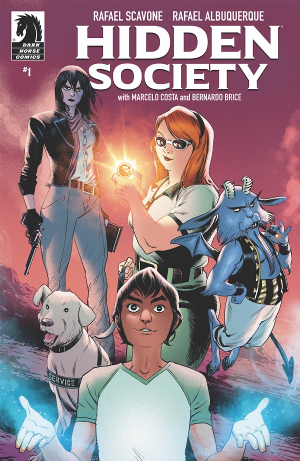
Publisher: Dark Horse Comics
Writer: Rafael Scavone
Artist: Rafael Albuquerque
Colorist: Marcelo Costa
Letterer: Bernardo Brice
Released: February 26th, 2020
Rating: 4 Star

Hidden Society #1 is the start of a new series from Dark Horse Comics. This is a series, unsurprisingly, about a Hidden Society. Or rather, the Hidden Society. In a world where magic is real, only so many are willing to do what it takes to stop corruption.

Hidden Society is a series that merges many genres, including action and adventure, crime, and fantasy. That makes for a unique read, one that will be as unpredictable as it is entertaining. At the helm of this project, you’ll find Rafael Scavone (writer), Rafael Albuquerque (artist), Marcelo Costa (colorist), and Bernardo Brice (letterer).

Hidden Society #1 alt

The Plot

Hidden Society #1 is already making the unique and fascinating qualities of this series quite clear. There are several…interesting…characters that have to be brought together in order to form (or reform) the Hidden Society. And that requires us to get to know a large number of them all at once.

That being said, I actually loved the way each and every character has been introduced so far. They all are utterly different from one another, and thus their origin stories (so to speak) are all dramatically different. It made for a quick-paced introduction.

As for the core of the plot? That has only been hinted at thus far. It’s clear that there’s something much more dangerous lurking behind what is visible. It’s almost a feeling, though the darker elements of each character’s backstory help to imply it as well. It will be interesting to see that all openly discussed, perhaps in the next issue?

I’m actually really enjoying the combination of themes and elements here. It feels like it’s something I’ve been looking for, as the crime elements allow for a much darker and grittier fantasy series.

Hidden Society #1 pg1

The Art

The artwork behind Hidden Society #1 is dramatic and bold – exactly what this plot needed, and what I was hoping for. There’s a lot to love about this series, from the character designs to the settings.

Let’s talk about those characters, and their introductions for a moment, shall we? Each character had their own dramatic intro, with one exception. There is one pair introduced at the same time, but it made thematic sense.

Each introduction seemed to have its own color palette. Or rather, a dominant color that could be spotted throughout. It was a really nice touch. It not only emphasized the different backgrounds here but set the tone for each character.

Hidden Society #1 pg2

In Conclusion

Hidden Society #1 is a fascinating start to a series, as well as being an engrossing one. I honestly can’t wait to see more of these characters interacting – and more of the threat they’re about to face.

Review: Falcon & Winter Soldier #1

Falcon and Winter Soldier #1

Publisher: Marvel
Writer: Derek Landy
Artist: Federico Vicentini
Colorist: Matt Milla
Letterer: VC’s Joe Caramagna
Released: February 26th, 2020
Rating: 4 Star

Falcon & Winter Soldier #1 is the start to a new miniseries, following two heroes who have both borne the same mantle, once upon a time. While that fact may be true, these two heroes couldn’t be more different if they tried. That is admittedly what makes their interactions so entertaining for the fans.

There’s no doubt in my mind that this series was launched in order to increase the hype for the Disney+ series. But I also have no problem with that, as these two are highly entertaining to watch together.

One thing I will say right off the bat for this issue? The title page took a minute to quickly (very quickly) go through both Sam Wilson and Bucky Barnes’ backstory. That’ll make it easier for any new fans to pick it up. That’s something I always love seeing because new fans are always a great thing (especially in the comic book world).

Falcon and Winter Soldier #1

The Plot

Falcon & Winter Soldier #1 was a seriously entertaining read. Right from the first pages, it draws fans in. Though perhaps I’m biased here, as I really enjoyed seeing Barnes go above and beyond in regards to protecting his cat. It was a nice touch that sold this crazy cat lady on the series.

What was great about this first issue is that it provided reasons for both heroes to care. It’s one of those classic situations where they ended up on the same path, not because one asked the other for help, but because they were tracking two totally different things. Or, in this case, people.

Derek Landy was the writer for this issue, and so far I’m loving what he’s doing with this team dynamic. They’re not exactly willing, which is a fact I adore. But they do work well together, you know, when they actually agree to do so.

The whole concluding scene has left me anxious to see what will happen in the next issue. I’m already a little bit sad that this is only going to be a miniseries, instead of something longer.

Falcon and Winter Soldier #1 pg1

The Art

Falcon & Winter Solider #1 had a pretty fantastic artistic team at the helm. Federico Vicentini was the lead artist, with Matt Milla providing colors, and VC’s Joe Caramagna doing the lettering. Together they made an interesting plot so much more.

One thing everyone knew right off the bat; this was going to be a series full of action and fighting. Thankfully, this team is up for that challenge. I personally loved their portrayal, showing off several different fight scenes (and the aftermath).

There’s a real sense of impact and motion during those scenes. It made them more thrilling to see, naturally. It also really showed off how differently Sam and Bucky fight, which is a major highlight in my book.

Falcon and Winter Soldier #1 pg2

In Conclusion

Falcon & Winter Soldier #1 was everything I had hoped it would be. It was intense and engaging. And it wasn’t afraid to throw in a little comic relief, courtesy of these two drastically different heroes interacting with one another.

Review: Red Mother #3

Red Mother #3

Publisher: Boom! Studios
Writer: Jeremy Haun
Artist: Danny Luckert
Letterer: Ed Dukeshire
Released: February 19t, 2020
Rating: 4 Star

Red Mother has been a truly chilling series, right from the start. In the span of just a few issues, Daisy has been through hell and back. Though perhaps not literally. Not yet, at any rate. What is in store for her is a lot less certain, so I’m not going to rule out that possibility.

Daisy McDonough had been a woman content to live her life, enjoying time with her boyfriend, while working on projects for fun. But that was all before she and her boyfriend were attacked. Now he’s missing, and she’s still struggling to cope with the fallout.

Last we saw, a mysterious box had been left on her door. I for one had spent more than my fair share of time wondering about what the intriguing item could possibly have been. So naturally, this is an issue I was very much looking forward to.

Red Mother #3

The Writing

Red Mother #3 was written by Jeremy Haun, and man does he have a great sense of storytelling here. I’ve been so curious to see what the item could be, that I was worried it wouldn’t live up to my expectations. I needn’t have worried.

The intrigue level jumped all the way up to a ten in this issue, as the item was not what I expected. Nor was the sender who or what I was expecting. It’s still chilling, thinking about what it all could mean. But for a completely different reason.

This issue balanced fascination with trauma in a very careful manner. Daisy is far from being healed, emotionally or physically. But for the briefest moment, it almost felt like she was on that path. Given what we know, and what she doesn’t know, that feels unlikely to be true. But that’s just making the read all the more exciting, don’t you think?

Red Mother #3 pg2

The Art

The artwork behind Red Mother #3 is truly stunning. It’s dark yet elegant, which is a perfect combination when you think about it. There were lots of fine details that needed to be portrayed here, thanks to the nature of the gift Daisy received. Yet that only helped to enhance the story as a whole.

Danny Luckert was the least artist for this issue, providing both the lines and the colors. They’ve done a fantastic job, as the world really comes alive here. Everything from Daisy’s scar to the way she explores her world seems so vivid and real.

The rare glimpse into that red world is a delightful pop of color – even while being highly terrifying. In a way, it sort of reminds me of the way the Purple Man tends to affect the pages around him. He doesn’t even have to be physically present in order for readers (or viewers) to know he’s there. It’s much the same way for this Red Mother.

Ed Dukeshire was the letterer, and they unsurprisingly did a great job. He’s always known how to balance things, how much is too much and so on. That knowledge is used to great effect here, as this is such a delicate story unfolding.

Red Mother #3 pg3

In Conclusion

Red Mother #3 was another thrilling read, but it felt different for several reasons. In this case, different is good. The intrigue has taken a new form, and with it, it almost feels like Daisy is once again taking control of her life. For better or for worse. Only time will tell.

Review: Alienated #1

Alienated #1

Publisher: Boom! Studios
Writer: Simon Spurrier
Artist: Chris Wildgoose
Colorist: Andre May
Letterer: Jim Campbell
Released: February 12th, 2020
Rating: 4 Star

Alienated #1 is the start of an all-new series from Boom! Box, and consider me sold! That cover alone is reason enough to check this issue out. The vibrant colors and characters showcased there are compelling and eye-catching.

Alienated is about three teenagers and the unlikely series of events that results with them being irrevocably bound to one another. Given how these three teens couldn’t possibly be more different from one another, that is going to result in a lot of chaos…and drama. And that’s if they’re lucky.

Alienated #1 alt

The Writing

Alienated #1 was written by Simon Spurrier, and he did an excellent job of pulling readers right into this story. Each teenager gets their own introduction, which naturally comes with a flair for their own personality.

Samuel is a bit of a loner, one who desperately wants to be seen and acknowledged. Samantha just wants to survive the next year and get out of this town. Sami is a kid who desperately wants to be liked – so much so that he has fooled himself into believing it.

Despite the fact that we’re quickly introduced to those three before the plot itself is even mentioned, this issue doesn’t feel rushed in the least. There’s no sense of an info-dump or anything like that. Instead, we simply got to know these kids and their quirks. And it’s clear that there’s a whole lot more to each of their stories.

One highlight of this series so far was the room it made for social commentary. It wasn’t anything overly drastic, but it was certainly there. Unavoidably so, much like in real life. I rather enjoyed that nod.

The plot itself has really barely begun. It’s also not the sort of thing that I’ve been able to predict, and I love that. This is a plot that is chaotic and funny at times, while clearly being okay with getting darker when needed.

Alienated #1 pg1

The Art

I already gushed a little bit about the cover-up above, but I want to emphasize how much I love it. It’s also an excellent indication of the sort of artwork you’re going to find inside Alienated #1. The artwork is so bright and colorful while showcasing everything from the doldrums of everyday life to the insanity of the unexpected.

Chris Wildgoose was the lead artist for this issue, working alongside Andre May. Together they provided both the lines and the colors, and they did a very impressive job on both counts. I love how each point of view has its own style and color palate – a fact that becomes vital later in the issue (and I’m sure will continue to be relevant later in the series).

Jim Campbell was in charge of lettering for this project, and I honestly love what they did here. They took advantage of white space to add weight to certain lines while working hard to make other parts feel unobtrusive. It’s a fascinating blend, one that worked well with the unique nature of this series.

Alienated #1 pg2

In Conclusion

Alienated #1 is a strong start to what is sure to be a memorable and distinctive series. It’s already proven to have an entertaining balance of humor and grim moments, which will surely help it in the long run. I for one am very much looking forward to finding out more about what is happening here.

Review: Hawkeye: Freefall #3

Hawkeye Freefall #3

Publisher: Marvel
Writer: Matthew Rosenberg
Artist: Otto Schmidt
Letterer: VC’s Joe Sabino
Released: February 12th, 2020
Rating: 4 Star

Hawkeye: Freefall #3 continues Clint Barton’s highly entertaining (and somewhat chaotic) latest run. This is a series that I quickly fell in love with, and one that I would happily see go on forever. Why? Because it portrays the Barton I love so much. The slightly insane and quirky character who comes up with grand schemes all while getting himself into a heap of trouble. Sound familiar?

A quick summary of the series so far, before I begin: Somebody has been masquerading around in the Ronin costume once again, specifically targeting The Hood and his people. As you can imagine, this has made more than one villain and hero concerned. Obviously, Barton has been the center of attention, and that has resulted in even more chaos than usual for him.

Hawkeye Freefall #3

The Writing

Hawkeye: Freefall #3 was such a fun read. I was honestly sad when it finished because I was really enjoying all of the crazy antics that Barton was getting up to here. Sadly, it’ll be another month before I get to see what happens next.

Matthew Rosenberg wrote something highly entertaining and interesting here. There are so many layers to this plot, most of which would be spoilers to openly talk about. Let’s just say that things are a lot more complicated than they look…which means that once again Barton is in over his head. And it’s all his own doing. Again.

I knew that this issue was going to have its funny moments – that should be obvious to anybody by this point. But I was not expecting just how funny those moments actually were. Seriously guys, don’t make the same mistake I did. Do not read this issue while taking a sip of water. You’ll regret it. It’s laugh-out-loud (or spit-take) funny, and there’s no warning for those moments.

I do have several questions about some of what is happening. But most of those questions are about extraneous details, so I’m sure I’ll get my answers in time. For now, I’m just going to sit back and enjoy seeing how this is all going to go down.

Hawkeye Freefall #3 pg2

The Art

This will come as no surprise, but the artwork for this issue was amazing. The funnier scenes wouldn’t have had the same punch without the details and expressions provided by the artistic team. The fight scenes and more dramatic moments were also pretty amazing, if I may say so.

Otto Schmidt was the lead artist for Hawkeye: Freefall #3. They did everything minus the lettering, which was provided by VC’s Joe Sabino. I’m honestly loving the look and vibe that this series has been putting out. So all credit to these two for what they’ve created here.

Hawkeye Freefall #3 pg3

In Conclusion

Hawkeye: Freefall #3 was a seriously entertaining read. It had a little bit of everything in it: romance (I adore Night Nurse’s appearance here), comedy, action, and drama. It has been everything I hoped for this series, and perhaps a bit more. I’m honestly really looking forward to the next issue, and hate that we’re going to have to wait a whole month for it!

Review: The Magnificent Ms. Marvel #12

The Magnificent Ms Marvel #12

Publisher: Marvel
Writer: Saladin Ahmed
Artist: Minkyu Jung
Inker: Juan Velasco
Colorist: Ian Herring
Letterer: VC’s Joe Caramagna
Released: February 5th, 2020
Rating: 4 Star

I’ve been a huge fan of Ms. Marvel ever since her series first launched, but for whatever reason I’ve never actually formally reviewed her issues before (but I have reviewed the volumes, so that’s something at least). I’m going to remedy that now because her series is so worth talking about.

The Magnificent Ms. Marvel #12 is the latest issue in a run written by Saladin Ahmed, and artwork by Minkyu Jung, Juan Velasco, Ian Herring, and VC’s Joe Caramagna. These creatives are a powerhouse and have brought a new perspective on Kamala’s story.

The latest plot arc for Kamala has been a pretty intense and emotional one. I’ll be honest, there’s been a moment or two where I had to put the issue down and give myself a minute. So I guess consider yourself warned there? Basically, Ms. Marvel’s father is ill – seriously ill, and for a while, things were looking very grim. Grim enough to warrant the need of somebody like Doctor Strange to step in, which really speaks volumes in and of itself.

Speaking of Doctor Strange, if you’re not up to date on his current series, you should probably check that out. It’s going to provide a lot of context to what is happening now, I promise.

The Magnificent Ms Marvel #12 pg1

The Writing

The Magnificent Ms. Marvel #12 was the perfect balance between superhero and human life. Kamala had two battles to face here; the one against her enemy (which, ironically, was previously her new suit), and the one for her father’s health.

That means she had to make choices here. Hard choices. The kind of things that nobody should ever have to make, least of all a young woman going through a difficult time. I don’t envy Kamala for the situation she’s in – yet it’s inspiring to see her go through it.

At the end of the day, it’s those human elements that make Kamala’s story so beautiful and powerful. It’s the reason why I’ll always come back and read (and love) her series.

Even if it is an emotional gut-punch from time to time.

The Doctor Strange element was a nice touch, though I still maintain that being up to date in his series will help. It isn’t required, but it’ll add so much more nuance to what he’s up to here. Or so I believe.

I’m struggling to say more without it all being spoilers. So instead, I’ll say this. This issue concludes the latest plot arc, and Saladin Ahmed did justice to everything that has happened. I can’t wait to see what Ms. Marvel will come up against next – though I am still mourning the loss of her suit (it was so cool! Before it turned evil, that is).

The Magnificent Ms Marvel #12

The Art

The artwork in The Magnificent Ms. Marvel #12 was fun and charismatic, yet unafraid to show the pain caused by impossible situations. I’m in love with this artistic team, truth be told. I know artists tend to swap out every now and then, but I’m really hoping that we don’t see a change on this lineup anytime soon.

I loved how vibrant and alive all of the scenes seemed. That has always been a feature I loved about this series –how it never shied away from color. You’d think I’d get over that with time, but I haven’t.

The Magnificent Ms Marvel #12 pg3

In Conclusion

The Magnificent Ms. Marvel #12 was everything I had hoped it would be, and then some. It was a brilliant yet emotional conclusion to an arc – one that did justice to both the characters and the fans. I don’t know what changes will be in store next for this young hero, but I’m looking forward to finding out.

Review: Adler #1

Review: Adler #1

Publisher: Titan Comics
Writer: Lavie Tidhar
Artist: Paul McCaffrey
Letterer: Simon Bowland
Released: February 5th, 2020
Rating: 3 1/2 Star

The League of Extraordinary Gentlemen meets Sherlock Holmes in Titan Comics’ latest series: Adler. This new series picks up the tale of Irene Adler herself, and she is on the hunt. She’s going to be collecting a group of women she trusts implicitly. All with the goal of taking down Moriarty himself.

This new miniseries is written by Lavie Tidhar, drawn and colored by Paul McCaffrey, and lettered by Simon Bowland. It’s a series perfect for die-hard fans of this dynamic woman – and doesn’t require you to have read any series previously in order to be able to dive in. I for one had no problems, though I certainly wouldn’t mind a bit more information here and there (for curiosity’s sake).

Adler #1

The Writing

Adler #1 was an interesting yet complex read. I went into this series knowing that it would feature other strong and independent women, while still expecting most of the focus to be on Adler. That may become true later. But this series was afraid to start off by introducing us to the other ladies in this group, namely the nurse and presumably newest member to the team.

Her backstory was a fascinating one, albeit a heartbreaking read. They did an excellent job of creating somebody so compelling, while also raising curiously about her and her connection to the story as a whole.

Don’t worry, the issue did get around to introducing us to Irene, and she’s as spirited and observant as ever. She’s picked up the trait of declaring observations (and then explaining how she came to that conclusion). It’s not always an endearing habit, as we all well know. But she pulls it off nicely.

The (re)introduction of Moriarty went about as well as one might expect. That is to say, his character is exactly what I had hoped and expected: he’s dark and brilliant, and utterly unafraid to make a move, or in this case, make a warning perceived as a move.

Adler #1

The Art

There’s something very charming about the artwork of Alder #1. For starters, I really appreciated the inclusion of character designs at the beginning of the issue. It was a quick refresher and allowed readers to be able to immediately know who is who. Given the varied cast, that’s an important bit of information to go in with.

The series is highly stylized and influenced by the time period, which again, is really perfect. I particularly enjoyed the level of expressiveness included on the faces. There’s one expression in particular (one of horror, naturally) that will make me giggle every time I see it.

The color palette is rich and beautiful, and I could happily look at it all day long if you let me. I love how it was all complementary, even while fitting the period and sometimes more somber nature of the story.

Adler #1 alt3

In Conclusion

Adler #1 was not quite what I expected, but I did still find it to be a highly entertaining read. I’ll be curious to see where this series goes. And how far they’ll able to push the plot. It seems unlikely that they’ll have the hunt be a successful one, but hey! This series could surprise me, and wouldn’t that be something?

Blog at WordPress.com.

Up ↑