

Publisher: Boom! Studios
Writer: Simon Spurrier
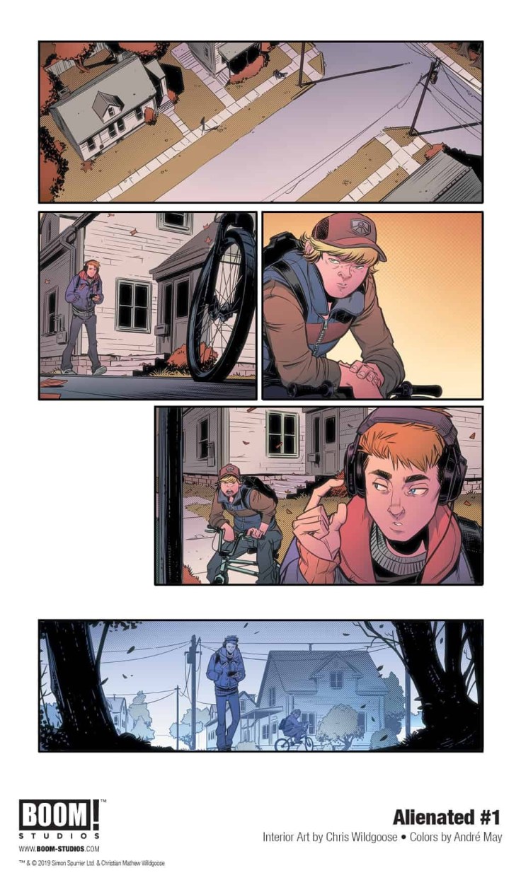
Artist: Chris Wildgoose
Colorist: Andre May
Letterer: Jim Campbell
Released: February 12th, 2020
Rating: ![]()
Alienated #1 is the start of an all-new series from Boom! Box, and consider me sold! That cover alone is reason enough to check this issue out. The vibrant colors and characters showcased there are compelling and eye-catching.
Alienated is about three teenagers and the unlikely series of events that results with them being irrevocably bound to one another. Given how these three teens couldn’t possibly be more different from one another, that is going to result in a lot of chaos…and drama. And that’s if they’re lucky.

The Writing
Alienated #1 was written by Simon Spurrier, and he did an excellent job of pulling readers right into this story. Each teenager gets their own introduction, which naturally comes with a flair for their own personality.
Samuel is a bit of a loner, one who desperately wants to be seen and acknowledged. Samantha just wants to survive the next year and get out of this town. Sami is a kid who desperately wants to be liked – so much so that he has fooled himself into believing it.
Despite the fact that we’re quickly introduced to those three before the plot itself is even mentioned, this issue doesn’t feel rushed in the least. There’s no sense of an info-dump or anything like that. Instead, we simply got to know these kids and their quirks. And it’s clear that there’s a whole lot more to each of their stories.
One highlight of this series so far was the room it made for social commentary. It wasn’t anything overly drastic, but it was certainly there. Unavoidably so, much like in real life. I rather enjoyed that nod.
The plot itself has really barely begun. It’s also not the sort of thing that I’ve been able to predict, and I love that. This is a plot that is chaotic and funny at times, while clearly being okay with getting darker when needed.

The Art
I already gushed a little bit about the cover-up above, but I want to emphasize how much I love it. It’s also an excellent indication of the sort of artwork you’re going to find inside Alienated #1. The artwork is so bright and colorful while showcasing everything from the doldrums of everyday life to the insanity of the unexpected.
Chris Wildgoose was the lead artist for this issue, working alongside Andre May. Together they provided both the lines and the colors, and they did a very impressive job on both counts. I love how each point of view has its own style and color palate – a fact that becomes vital later in the issue (and I’m sure will continue to be relevant later in the series).
Jim Campbell was in charge of lettering for this project, and I honestly love what they did here. They took advantage of white space to add weight to certain lines while working hard to make other parts feel unobtrusive. It’s a fascinating blend, one that worked well with the unique nature of this series.
In Conclusion
Alienated #1 is a strong start to what is sure to be a memorable and distinctive series. It’s already proven to have an entertaining balance of humor and grim moments, which will surely help it in the long run. I for one am very much looking forward to finding out more about what is happening here.


