
Get Ready For Giant-Sized Action in Big Girls #1
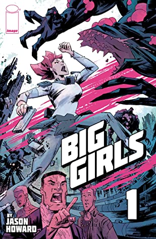
Image Comics is about to launch an all-new series, and it all starts with Big Girls #1. Written and illustrated by Jason Howard, this is one of those series you’re going to want to pay attention to.
This series caught my attention the moment it was described as a cross between Pacific Rim and Paper Girls. How can you see that sort of marketing and not give it a try? Seriously. Then again, I’m a major fan of those comparisons, so I’m clearly biased. Hopefully, you are as well.
This is a world where there are people larger than life – literally. Some are compelled to destroy. Then there are those like Ember, who only want to protect and cherish. And to think, she’s one of the lucky ones.
Writing
Big Girls #1 starts with a bang, almost literally. This is a series that wastes no time, throwing readers right into the deep end of events. And those events? They get a bit dark. It’s appropriate for the setting, and it certainly goes a long way in establishing the stakes.
The backstory is told through a series of quick bursts, yet it is efficient for explaining everything that has happened and leaving hints for what is likely to come in the future. It all has a very Attack On Titan vibe, at times.
Ember’s character is exactly what the world needed. She balances out all of the dark, providing a human element in a world that appears to be rapidly losing its reason to care. The title of the series implies that there will be more than one like Ember (the ‘s’ in Big Girls), but so far, we just have Ember to latch onto.
There’s still a lot to learn about her character and the world that she lives in. It’s already clear that there is more happening here than meets the eye; now we’re really just waiting on an explanation. Or two. Either way, this first issue has successfully grabbed attention. And in my case, held it.
Art
Big Girls #1 is full of bold and heavily stylized artwork. There is this rougher quality to the artwork, one that compliments the concept of a dystopian science fiction series. It does feel like the world is falling apart while we’re looking at it.
It takes effort to make the changing scales shown in this series work, yet it seems to be effectively done here. There are times when Ember steals the show, yet it’s clearly the intent. Meanwhile, the other characters portrayed have a range of designs and expressions, sometimes bordering on the extreme end, which suits the series nicely.
The climactic scene in this issue was…intense. And a huge part of why it hit so hard is because of what we were shown – not told. I honestly don’t think that the scene would have been the same without the artwork supporting it.
Finally, I have to give credit to Fondgrafiks for providing the lettering. The lettering provided a sense of balance and stability to this world. All while also being a bit of a window, giving hard facts when needed.
Conclusion
Big Girls #1 was an intense yet fascinating start to a new series. Personally, I’m already looking forward to reading the second issue, and so on and so forth. Having read this first issue, I can completely understand the comparisons made during the marketing campaign. They’re already proving to be spot-on. However, Big Girls is also providing its own flare, naturally. Here’s hoping that trend continues.
This review was originally written for Word of the Nerd, but has been ported over to Quirky Cat’s Fat Stacks now that the site has shut down.


Leave a comment